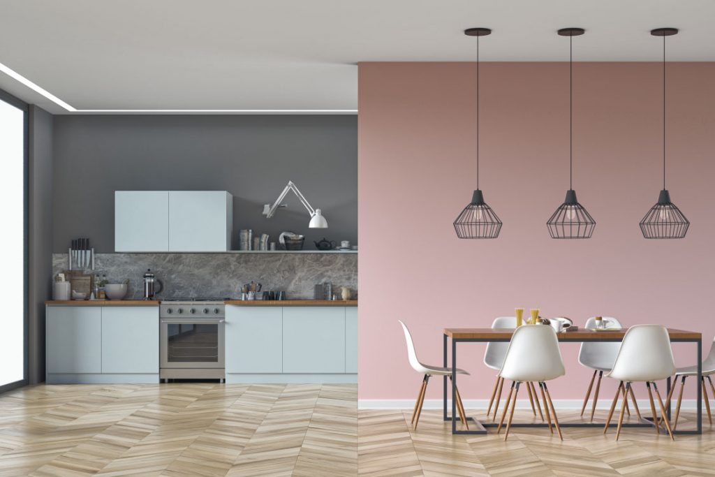
Colours in the Kitchen
The relationship between different colours is one of the first things we learn as children in school. From colour wheels, splitting light through prisms and, even more simply, having ‘good’ art rewarded, the relationship between different colours is a lesson learnt time and time again.
As kitchen designers, we wanted to find out why our instincts so often become clouded and confused as soon as we begin planning our dream kitchens. What exactly makes a good kitchen colour scheme, and how do we avoid the pitfalls of bad colour combinations?

Where to Start?
Before going any further, it is worth reminding yourself of the basic principles of the colour wheel. Primary colours mix to create secondary colours. ‘Cold’ and ‘warm’ colours will be grouped together on one side of the wheel – and these are ideal for setting moods in a room.
For example, ‘cold’ colours are typically thought of as blues and purples. ‘Warm’ colours reflect those of our sun – yellow, red, orange! Regardless of whether you choose cold or warm, picking colours close to one another on the colour wheel will result in a concordant, professional look.
An even more extreme example of this would be to paint the entire kitchen in varying shades of a single colour. This is a great, simple way to achieve consistency in your colour palette – although it can prove a little dull at times.
A great way to liven up these – and any – kitchens is through careful selection of an accent colour. This will ideally be a complimentary colour (i.e. colours that are opposite one another on the colour wheel). Accent colours are a really effective way to add personality to a kitchen, but you have to be careful.
For instance, accent colours are just that – accents! They should only exist in small flourishes in the kitchen, such as behind a hob or sink. And, although some kitchens can get away with two accents, most are best suited to a single accent.
In some cases, colour clashes can even work, although this is very much a case of ‘use with caution’.
What Else?
Lastly, you have neutral colours. These are not found on most colour wheels, and they comprise colours such as greys, blacks and browns. Neutral colours may be non-offensive, but they can still be impressive in the right content.
For instance, charcoal is a colour extremely on-trend at the moment. However, for all its modernity, its inherent neutrality as a shade of grey lends it a refinement and class that, when paired with more traditional cabinetry creates a look that is both contemporary and classic.
We all want to use colour schemes to display our personality – particularly in our kitchens. However, by reminding ourselves of some the principles of our childhood education, a good kitchen design can be lifted to a great one.

